top of page

TYPEFACE COMPARISON POSTER
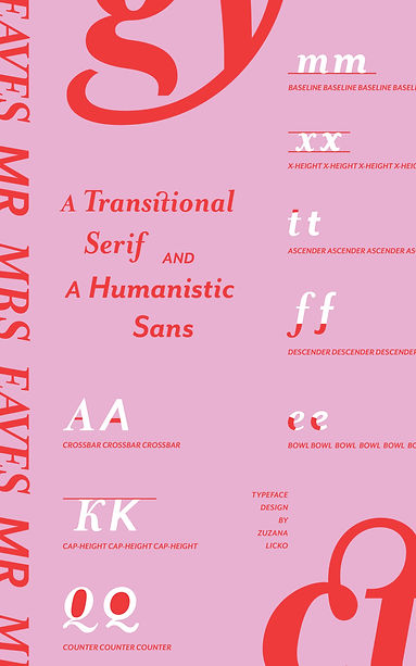
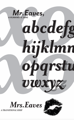
I designed a type specimen poster to expand my knowledge of the anatomy of typography by comparing and contrasting a serif (Mrs. Eaves) and a sans serif (Mr. Eaves).
 |
|---|
 |
 |
 |
 |
 |
 |
 |
Thumbnails
I started by researching the anatomy and purpose of the typefaces. I made several thumbnails exploring various layout possibilities and overall design approach.
 |  |  |
|---|---|---|
 |
Digital roughs
Here are a few digital roughs I made after narrowing down my most successful thumbnails. Mr. and Mrs. Eaves are often used in book cover design, so I wanted to incorporate that feel in my final design.
Color
Limiting myself to the use of 3 colors, I tried out some different colorways until I landed on the most successful approach.
 |  |  |
|---|---|---|
 |

bottom of page